Maria Rigol Ordi · SpainDesign & Packaging
Vinya Llarga.
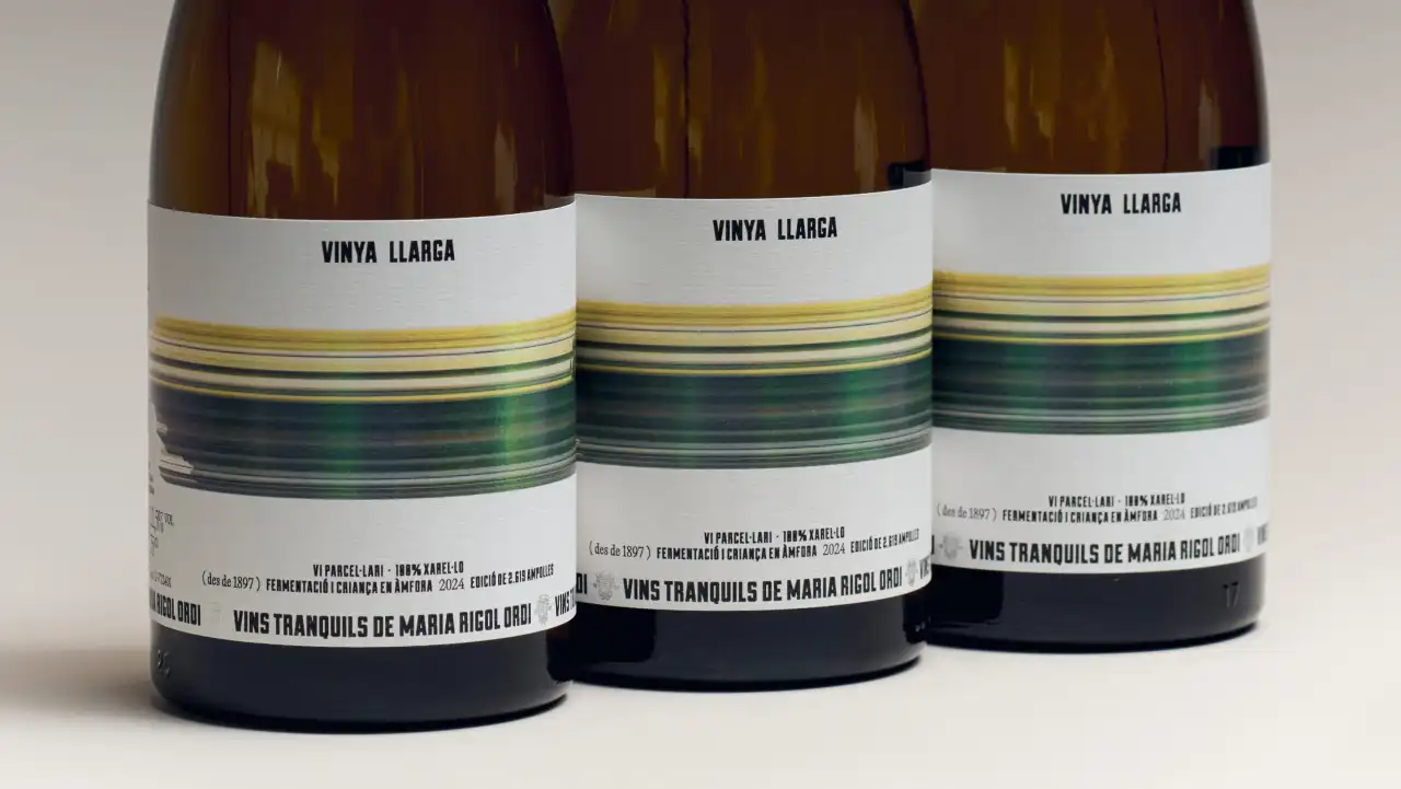
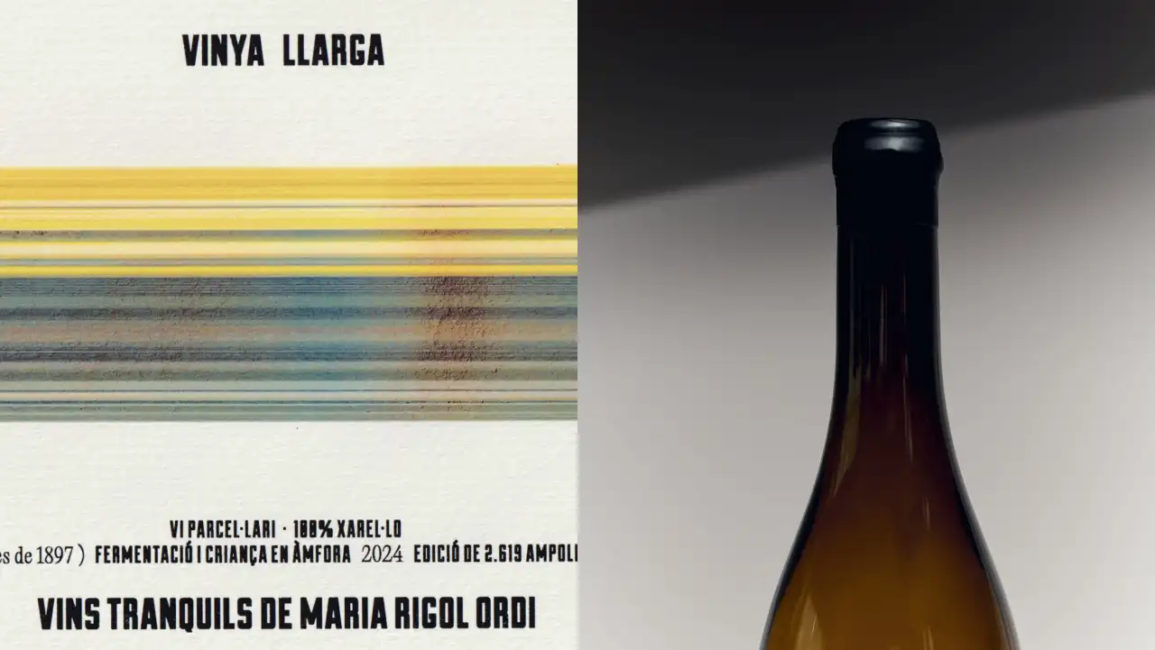
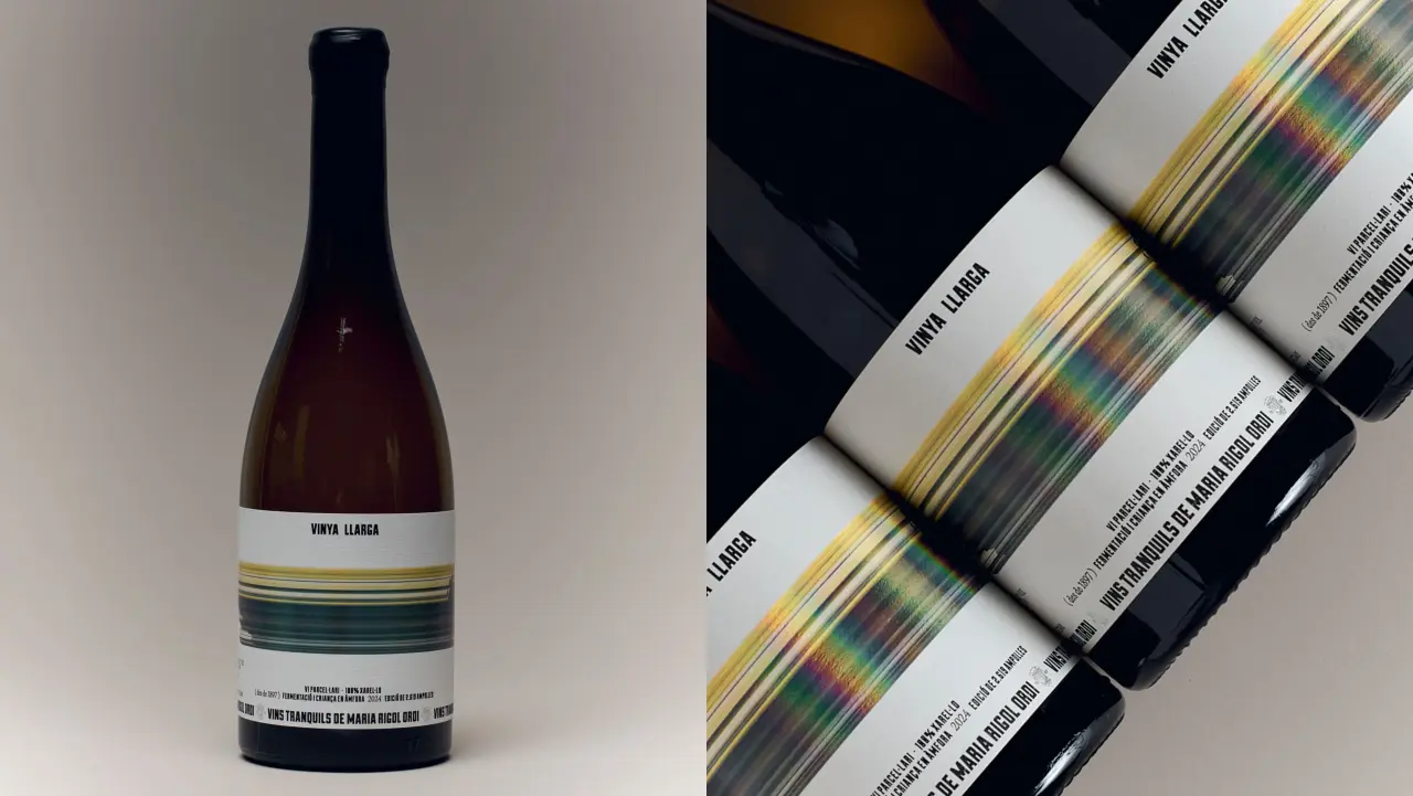
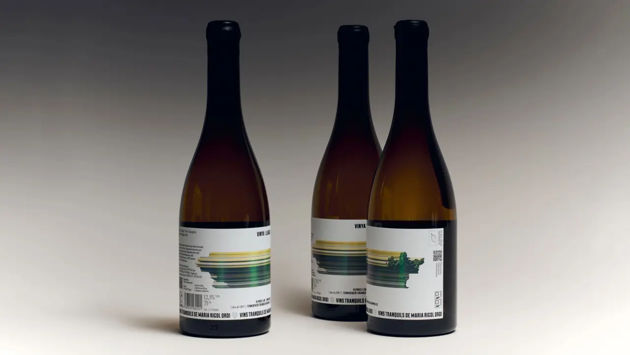
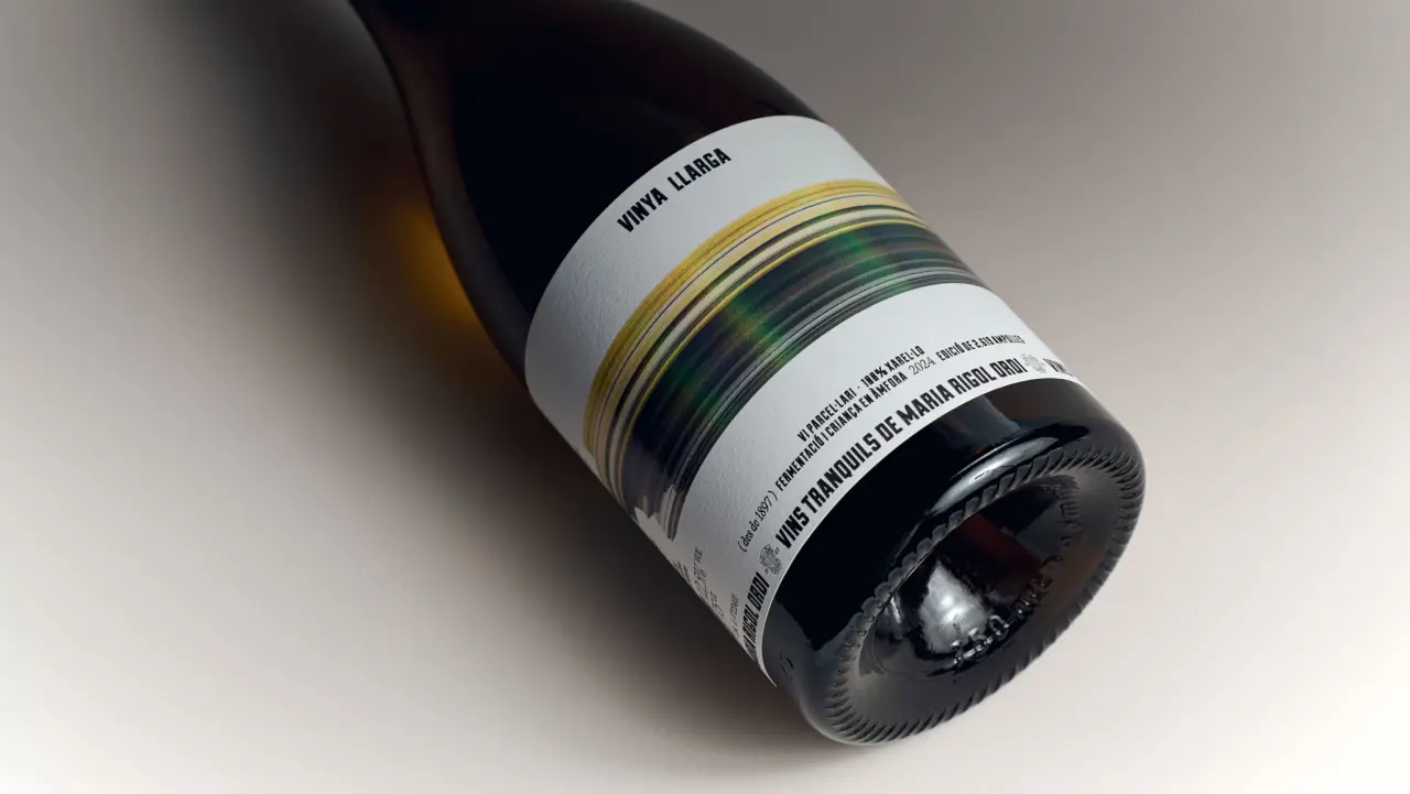
Atipus turns the meaning of Vinya Llarga into a wraparound label, with streaks of landscape colour and a tactile wax finish.
- Brand
- Maria Rigol Ordi
- Agency
- Atipus
- Market
- Spain
- Region
- Global
Campaign images
The challenge
Give Maria Rigol Ordi’s first still wine a distinctive expression while retaining a connection to the producer’s craft.
The idea
The label stretches colour around the bottle to suggest a vineyard seen in motion. Restrained typography lets the landscape carry the story, while the wax-sealed capsule adds a physical counterpoint.
Case study source: Atipus, submitted to Packaging of the World; Creative Boom Source ↗
Awards
- Laus 2026 — Inbook, Packaging (reported by Atipus)
Credits
- Brand
- Maria Rigol Ordi
- Design agency
- Atipus
- Photography
- Marc G. Camps