White & Case · Global · 2026Design & Packaging · B2B · Film · OOH
The Power of Complexity.
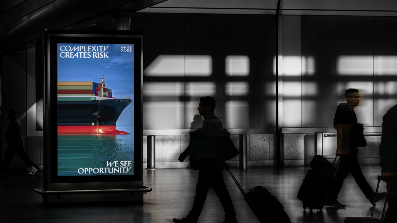
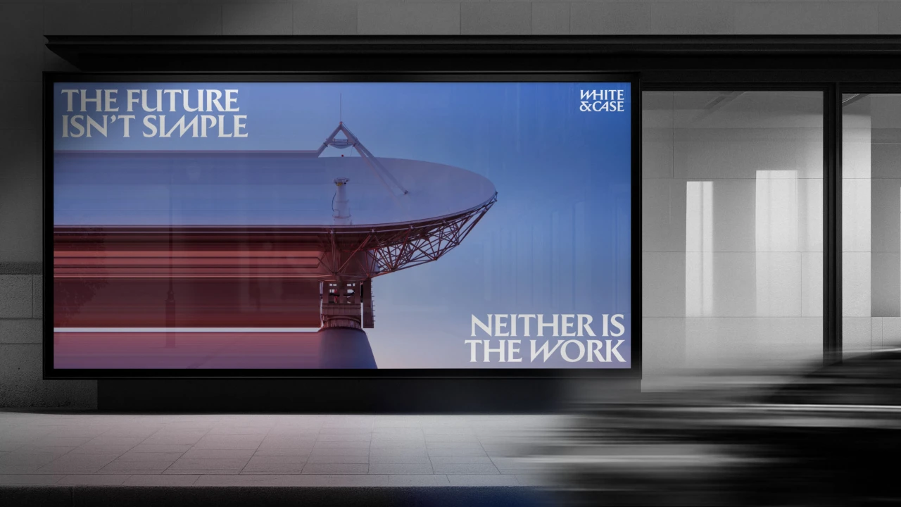
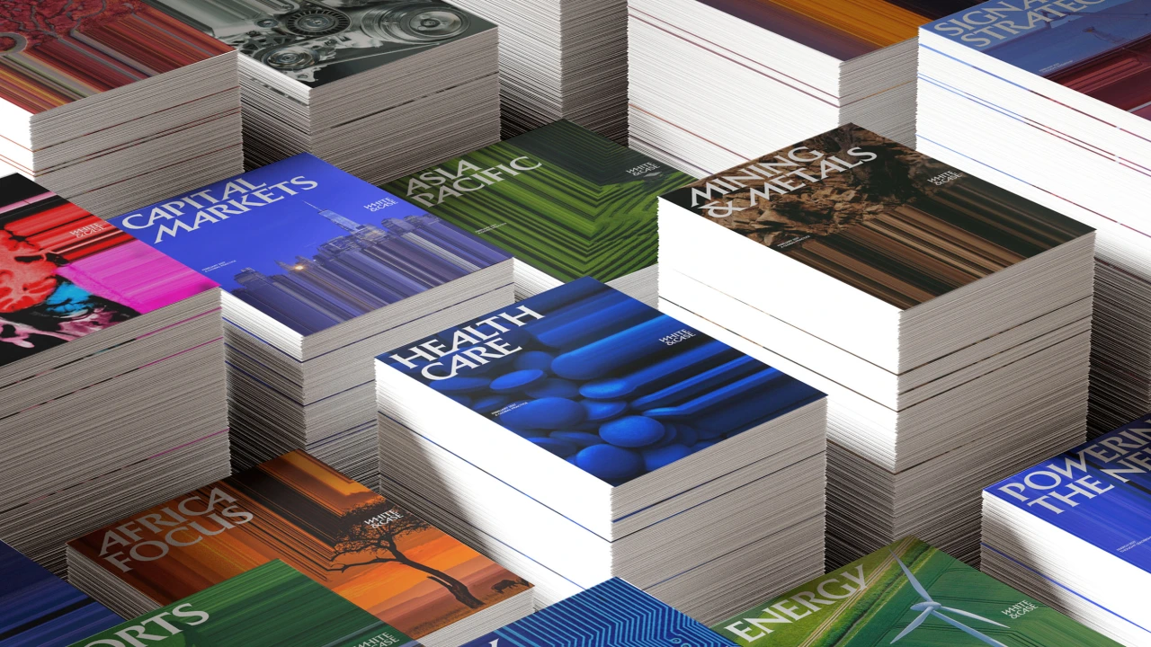
A global law firm makes complexity the centre of its identity, using energetic typography and imagery to express the work it does for clients.
- Brand
- White & Case
- Market
- Global
- Region
- Global
- Year
- 2026
Campaign images
The challenge
Give White & Case a distinctive public identity that reflects the complexity of its clients’ matters and the firm’s international reach.
The idea
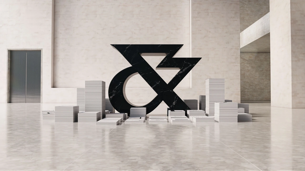
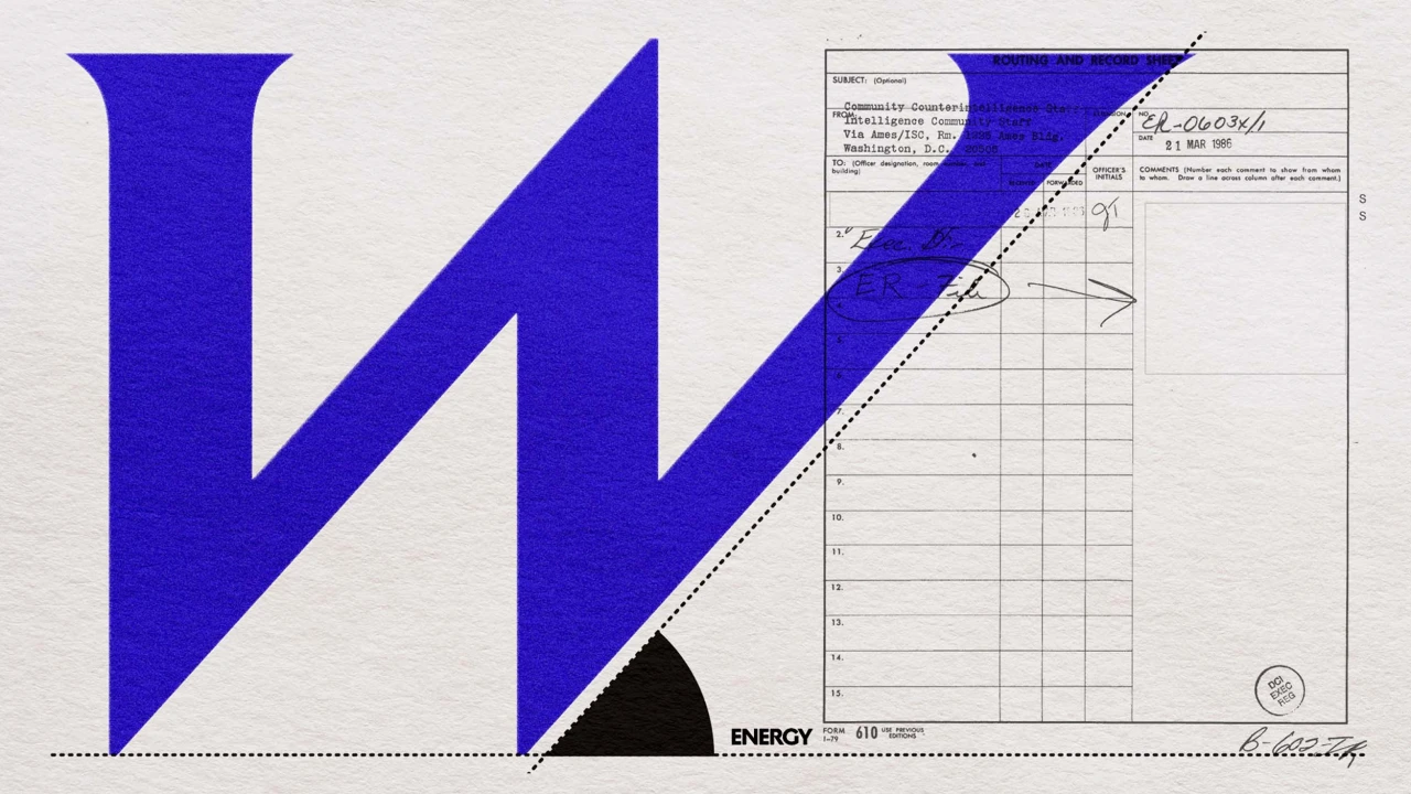
Uncommon built a visual system around a stone-inspired wordmark, a standalone ampersand and vivid blue. Kinetic typography and transformed photography carry the idea through advertising, digital experiences and the brand film.
Case study source: White & Case; Uncommon Creative Studio; Creative Boom Source ↗
Credits
- Brand
- White & Case
- Brand identity
- Uncommon Creative Studio New York
- Agency partners, credited by White & Case
- Brandtech Consulting; Noble People
- Client Chief Marketing Officer
- Jason Hill
- Global Chief Design Officer
- Lisa Smith
- Client Creative Director
- Rob Reade