Coffee Planet adds an in-house CP monogram to its visual identity.
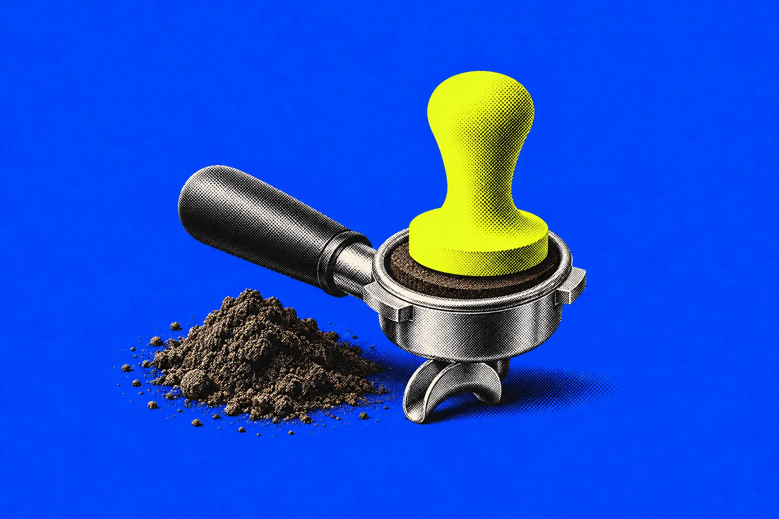
Coffee Planet, the UAE-founded coffee company, has introduced a "CP" monogram designed by its in-house marketing team. The symbol extends the existing identity rather than replacing it, and the wordmark, colours, typography and tone of voice stay the same.
Marketing manager Nishta Mital told Campaign Middle East the idea came from a practical problem: the COFFEE PLANET wordmark could look heavy in small spaces, even in stacked or linear layouts. She developed several concepts with the company's graphic designer, Fahd Malik, starting from "CP", the shorthand clients and industry contacts already use. The final mark joins the C and P around a coffee bean, with an outer shape that refers to a planet's orbit and a portafilter and, seen from above, suggests a coffee cup. Management reviewed the concepts and its feedback shaped the refinements.
The rollout is gradual. The first uses are print, digital and marketing material, email signatures, selected coffee shop touchpoints, event trolleys, hospitality stations, staff uniforms and pin badges. Packaging is not changing for now; packaging, signage and retail use will be considered later. The company has announced the mark on social media and plans to make it the profile image on its channels after Breast Cancer Awareness Month, when they carried pink branding. According to the company, its UAE retail presence covers more than 600 outlets and 40 retail brands, plus more than 80 Emarat stations and more than 20 Union Coop locations.
Coffee Planet says it will judge the monogram on how many touchpoints use it, the reach and engagement of content featuring it, and feedback from staff, clients and partners. It has not set a date for the profile change or for any packaging decision.
For brands in Saudi Arabia and the Gulf with long names and many formats, the case shows a low-cost, in-house route to a compact symbol: build it from a nickname people already use, and earn recognition through consistent use before letting it stand alone.
Why it matters
A homegrown UAE brand is turning a nickname customers already use into a compact symbol, an in-house route to small-format recognition that avoids the cost of a full rebrand.
Related trends.
KFC opens its first Muse restaurant in Dubai as it moves towards experience-led dining
KFC has opened the first restaurant in its new Muse format at Jumeirah Beach Residence (JBR) in Dubai, a concept built around design, technology and customer interaction. The brand says Seoul will get the second Muse site by the end of 2026.
Why it mattersA global fast-food chain picked Dubai to pilot its flagship format, treating the restaurant itself as a channel for content, loyalty rewards and new menu occasions.
Spine wins hasenkamp Middle East account after pitch of over six months
Spine Marketing Consultancy has won the communications, content, social media and strategic marketing account for hasenkamp Middle East, Campaign Middle East reported on 2 November. The pitch ran for more than six months and included several multinational agencies.
Why it mattersA specialist agency beating networks for a culture-sector account suggests the Gulf's museum and heritage build-out could create new B2B marketing briefs.
7-Eleven sells its Korean menu through a seven-part micro K-drama
7-Eleven is promoting its new Flavors of Korea menu with A Convenient Love, a short vertical K-drama series on Instagram and TikTok. Episodes start on 2 November and run until 23 November, each tied to a discount on one dish.
Why it mattersIt's a simple model for branded microdramas: each episode sells one product with one limited-time offer, so the series can be judged on redemptions rather than views alone.